Tuesday 20 December 2011

The Division of Labour.

We all contributed to stages of our project. 

The Pitch Powerpoint - Tessa Barton
Email for permission - Joe White
Textual Analyses - Emily Lowery, Joe White, Tessa Barton
Semiotic Analyses- Emily Lowery, Joe White, Tessa Barton
Magazine Advert Analyses- Emily Lowery, Joe White Tessa Barton
The Workshops- Emily Lowery, Joe White, Tessa Barton
Focus Group Analysis- Joe White, Tessa Barton
Questionnaire Analysis- Emily Lowery
Props and Actors Powerpoint- Emily Lowery
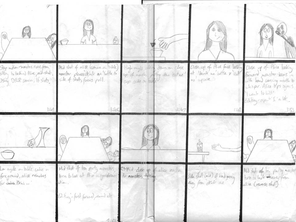
Storyboard- Emily Lowery, Joe White Tessa Barton
CD Case- Emily Lowery
Magazine Advert- Emily Lowery
Camera Work- Tessa Barton, Joe White, Emily Lowery
Lighting- Joe White, Emily Lowery
Editing- Joe White, Tessa Barton, Emily Lowery
Evaluation- Joe White, Tessa Barton, Emily Lowery

Thursday 15 December 2011

Evaluation: The Ancillary Design Process


This is a powerpoint showing the techniques we used in Photoshop in order to create out CD Cover and Magazine Advert. Answers part of the question: "How did you use media technologies in the construction, research, planning and evaluation stages?"

Wednesday 14 December 2011

Evaluation: Our Editing Techniques

This is a video showing what effects we decided to use, in final cut, to ensure that our music video was visually good and consistent with our branding. Answers part of the question: "How did you use media technologies in the construction, research, planning and evaluation stages?"

Monday 12 December 2011

Evaluation: Peer Assessment with Response

This is the third part of our evaluation. We showed our music video to our class mates and asked for their feedback. The overall replies were good with some criticisms which we respond to in the video. Answers part of the question "What have you learnt from your audience feedback?"

Saturday 10 December 2011

Evaluation: How effective is the combination of your main product and ancillary tasks?

Tuesday 6 December 2011

Evaluation: In what ways does your media product use, develop and challenge forms &conventions of real media products?

This video describes how we used our textual analyses to inspire our music video and where those inspirations are present. 

Saturday 3 December 2011

FINAL PRODUCT: The Music Video: Kill EVERYBODY by Skrillex


This is our Music Video. Kill EVERYBODY by Skrillex.

Monday 28 November 2011

FINAL Ancillary Text #2: Magazine Advertisement


This is our final magazine advert.
After reviewing our first draft, we felt that a creepily edited  photograph of our location, the woods, as a background would make it eye-catching and changing the middle "11" to red would be an interesting marketing technique. 


We tried to incorporate aspects of an advert which we had picked up on whilst doing our semiotic analyses- such as a graphic background similar to the one used for the CD single, and similar fonts used as the ones on the Single cover. Like our semiotic analyses, we placed the front cover of our single on the advert to ensure that the potential buyer would know what to look for in a store. Also, at the bottom of the advert, we included some reviews as this would be ideal for an advert because it could tempt people into purchasing the record. Also, we decided to add "Available on Itunes" in order to be relevant with media technologies today. In today's society, a hugh percentage of music sales comes from technological ways such as purchasing of Itunes or buying mp3 off of Amazon. Again, to keep in line with the official Skrillex font, we decided to make the two 1's in the middle of "11.11.11" in red as it mirrored the two "LL" used in the name. We decided to add a white border surrounding the single cover to make it more distinct against the background which has similar colours. It also makes it a distinct product.

Friday 25 November 2011

FINAL Ancillary Text #1: Single Cover

This is the final digipak. All of the images used were taken by us and edited using Photoshop. On the front cover, we decided to have the protagonist, Alice; the eyes have been edited to look possessed as this matches our branding: "Nightmare Alice". Also, the graphics that looks like scratches on the back and inside are images of Burnham Beeches edited to look creepy and claw-like. This again is in line with our Music Video as we filmed there to start and end the video. For the typography, we decided to try and mimic the official Skrillex font by putting the "LL" in red. This would give a realistic sense to our single if it was official. On the inside covers, we have reduced the opacity of some well known inter-textual references to Alice in Wonderland to give the suggestion of the theme: the eat me/drink me labels are seen on the inside left along with the pocket watch. Also, on the actual CD, we have faded one of the monsters featured in our Music Video to again give a sense of branding and continuity from Video to Ancillary Texts. 

Saturday 12 November 2011

Ancillary Planning: Ideas for Final Single Cover


These are all original photographs taken by us of the props we used for our music video. For our single cover, we asked a few peers what they thought and the agreed with us that we needed to suggest Alice in Wonderland a lot more through the cover. To do this, we think placing our props in various places around the single cover will be effective and not overboard in the sense that it would look out of place and roughly edited. This will then help us create a sense of branding and will ensure that the target audience will link our single cover with the nightmare-ish Alice in Wonderland theme of our music video.

DRAFT Ancillary Text #1: Single Cover

This is our first draft of our Single Cover. We have used original images which we feel portray our genre of music as well as the theme of our music video well. The creepy, horror sense is definitely felt yet we feel it does not link to Alice in Wonderland as much as we would like it to. We might add some photos of our props and actors in order to create a sense of branding between our music video and single cover.

Friday 11 November 2011

DRAFT Ancillary Text #2: Magazine Advertisement


This is our first draft of the Magazine Advertisement. We have tried to incorporate various techniques which we discovered through our semiotic analyses. Despite the techniques which we have utilised, we still feel that the text does not stand out as much as we would like. The single cover is centre of the advert which is key to grabbing our target market's attention but the plain black background seems a bit plain in comparison to how we feel out music video is. For a first draft, we like the typography and layout but we may aesthetically alter the advert to make it more eye-catching and relevant to our music video.

Thursday 10 November 2011

Ancillary Planning: The Font Choice

These are the fonts that we are trying to chose between and are all taken from "www.dafont.com". For our single and magazine advert, we want to ensure that the font looks close to the "Skrillex" one and goes with the sense of branding that would normally come with a techno/dubstep track. 


Sunday 6 November 2011

Ancillary Planning: Ideas for the Single Cover


All of these images have a similar "creepy" theme which is what we are aiming for. We decided to experiment with a variety of images before narrowing it down to one. This will allow us to ensure that we pick the right one for what we want. We used Photoshop to create the effects and when we have decided on what image we will use, we will do a step by step guide on how we create the final image. These are all our own images

Monday 31 October 2011

Planning: Actors


These are the actors that we are going to use for our music video. For choosing the character of Alice, we had to take into account the well-known appearance of her and case our actor to this appearance. It would not make sense if we chose to have a brunette Alice as this would not allow the audience to recognise the inter-textual reference.

Saturday 29 October 2011

Planning: Props


For our music video, we had to use many props. The majority of our props were used for the Tea Party scene. Included in the props, were a couple of inter-textual references to ensure that the audience would recognise the twisted Alice in Wonderland theme.

Planning: The location for our Music Video


Burnham Beeches


These pictues show one of the locations we intend to use for our music video. The colors will allow us to juxtapose this with a darker interior environment, and use post production effects to greater effect. The ambient lighting is also effective, with the trees casting shadows that we can use to our advantage. 


This is the location where we will film our twisted tea party scene. The hall in our school is an ideal place because the black curtains allow us to manipulate light and make it seem that the protagonist is in a surreal world rather than simply a classroom. 

Thursday 27 October 2011

Planning: Analysis of Audience Questionnaire (Audience Research)


To add to our focus group answers, we decided to see if more of our target audience had similar ideas. We decided to ask 20 males and females as we felt this was a good sample size. 

Wednesday 26 October 2011

Planning: Focus Group with Video Analysis (Audience Research)


We decided to ask a select number of people more "in-depth" questions rather than the simple "yes" or "no" as this would allow us to hear our target audience's views on what we will be doing with our music video. This video shows the questions asked, the focus group's reactions and our analysis of their responses.

Tuesday 25 October 2011

Planning: Editing to beat workshop


In our music video we intend to edit to the beat on occasion, however we may not edit to the most dominant beat as it is very fast and will not allow you to see the storyline in our narrative this way. We performed this work shop so we could experiment and get to grips with the task of editing in sync with the beat of a fast pace song.

Planning: Stop Motion Workshop


We are considering using Stop Motion in our music video as it creates a disjointed effect and can add to the surrealism we want to create in the music video. We would only include a small amount of Stop Motion, maybe around 5-10 seconds, as after doing our workshop, we realised how time consuming and difficult it can be. Also, we don't want it to distract from our linear narrative. 

Sunday 9 October 2011

Planning: Lip-syncing Workshop


As we intend to use lip syncing as part of our music video - to add to the simple narrative structure and surreality of the characters - we performed this workshop to practice lipsyncing and we additionally attempted to sync the guitar performance with the song. While performance won't be featured in our video, it is still useful to practice synchronising sound with the music for other use in the video. 

Planning: Lighting Workshop


Untitled from Emily Lowery on Vimeo.


This video is of a workshop we did to experiment with the use of low-key artificial light, for scenes filmed indoors instead of in our forest location. In order to create a gloomy and creepy atmosphere, the lighting is important to the mise en scene as it can make the costumes and location seem more surreal and twisted. 

Sunday 2 October 2011

Planning: Storyboard


Friday 30 September 2011

Planning: Magazine Advert Analysis (The Chemists)


This advert for a debut album by The Chemists features a minimalistic style and simple color scheme. While the album cover itself does not take up the majority of the image, the art style is consistent between the album and the advert which makes it easy to identify when trying to purchase it. Information such as a comment from Kerrang! and a release date are provided in simple, small font which draws your attention to the album itself and the artwork to compliment the album, making the viewer intrigued about the content of the album - such as the singles mentioned - rather than the reviews, of which only one is provided.

Planning: Magazine advert analysis (you me at six)


This advert is very eye catching with a wide range of colours across the page. You are originally drawn into the picture due to the striking image of bright colours, however you are then drawn to the band name in bold in the middle of the page. This is useful as once drawn into the picture you then associate it with the band name and want to read on. The picture is of the album cover, which is being advertised as the album is coming out soon. With our album cover we may follow a similar idea with a striking image and a bold font drawing the attention of readers. Although our picture will be a lot more darker and creepier in comparison to this. This picture has also  been made on a computer however we intend to take a picture then edit it.  

Planning: Magazine Advert Analysis (Blink 182)


This is the magazine advert for Blink-182's album. It's very simplistic in the way that it is only black and white and just has the information that you need about the album and the picture of the album cover. This could be a way of us organising our magazine advert as it gives the details in a simple way and is quite eye-catching in a minimalistic sense. The fact that the main focus is on the album cover is good as it makes sure the person looking at the advert knows what the album looks like in case they want to go out and purchase it. Also, it's not boringly simple due to the typography that links with the image. We could use just black and white to create the creepy effect we want and also keep it simple by just putting the details.

Thursday 29 September 2011

Planning: Semiotic analysis of Pendulum - Crush single cover


This single cover by Pendulum, a drum & bass band, connotes horror and also a degree of mystery. While human figures are identifiable on the image through the shapes of hands and faces seemingly screaming or in pain, the viewer is unable to view them in any detail due to the "thick glass" effect, which seperates the viewer from the characters preventing them from sympathising like they would with horror movie characters due to the surreal angle they view it from. This also leaves it very ambiguous what is actually being depicted, with the camera focus being on unneccessary detail on the glass such as scratches rather than the details beyond. The dark, monotonous colour scheme also creates a gloomily surreal atmosphere which furthers these horror connotations. Overall the viewer is kept disconnected from the cover which may make them naturally curious to watch the video, yet aware that there are horror connotations at play.

Planning: Semiotic analysis of Bring me the horizon album cover


This is an album cover from the band bring me the horizon. The album cover is eerily stylised which fits with our genre.


Denotation: 
A female is in the center of the album cover grasping what appears to be her own intestines. Her face expresses no emotion or pain, which gives the cover a paranormal as you would expect her to be in pain. The reverse side of the cover has a close up image of the female’s hands and waist, which are drenched in blood implying a wound. The track listing and barcode covers up much of the detail of the wound. In comparison, the typography on the front cover is transparent which does not take attention away from the detail and gore of the female.

Connotation: 
The theme of horror is clearly established by the gore and surreal lack of emotion portrayed by the female. This connotes that the music or any music videos may be less mainstream due to the violent theme suggested. The contrasts of black, white and red connotes that the scene is synthetic rather than natural. The emotionless expression on her face connotes that she is disconnected from the world and may be supernatural due to the fact that a human should be in intense pain. The close up of the blood drenched hands symbolizes the horror that we wanted to incorporate in both our single cover and our movie. The track listing and barcode covers up much of the detail of the wound this connotes the sense of fear of the unknown, which can create fear as you don’t know what is hiding behind it. Overall we like the idea of the female protagonist looking creepy and suggestive and we would like to incorporate this theme in our single cover.

Planning: Semiotic Analysis of Prodigy Album Cover


Denotation: The main image on the front depicts a face which is frozen in mid-scream. It is questionable whether it is a mask or a real person. The typography for “Prodigy” seems to be bent and almost 3D like whilst also in black and white. The overall colour scheme of the whole album is gritty with a lack of bright colours. On the back, there are photos of the band and a track list beside which seems simplistic and common for an album cover.

Connotation: This album overall connotes horror and terror. The main photograph clearly depicts a person either in extreme pain or full of rage. This would indicate that The Prodigy’s music is both intense and absorbing whilst also making you feel emotion. This is similar connotations to that of the 3D text which makes it seem that it is coming right out at you and you have nowhere to hide. The gritty colour scheme connotes a lack of hope and a world of terror due to the fact that there are no bright colours which could symbolise hope. The fact that it is unclear whether it is a mask or an actual person also connotes a sense of the unknown which further creates a sense of fear and horror; theme which we would like to portray in both our ancillary text and music video.

Planning: Semiotic Analysis of Stenchman Album Cover


As we are steering towards the Dubstep genre, it would be appropriate to analyse CD cases from similar genres. This free online album by Stenchman conveys an urban yet creepy feel.

Denotation: The main photograph depicts a character in a mask which hides his/her identity standing in an abandoned, dirty warehouse. The font colour is white and stands out against the gritty colouring of the warehouse. The typography is simple yet the words utilised link to the photograph in an effective way. In the background, there is a bright beam of light shining towards the lens which lights up the unknown character whilst also creating a red tint across the opposite side of the single cover.

Connotation:The theme of horror is established through the unknown character masked in the center of the photograph. The fact that he is wearing a mask connotes a sense of the unknown and alludes to iconic Horror films where the psycho-killer wears a mask (for example Halloween). This removes identity and creates fear which is a key theme for our music video. The abandoned dirty warehouse gives connotations of isolation and decay (as does the character’s mask). This creates a theme of death and gives associations of murder which leads to fear. The gritty colours of the album cover connote a dark, niche genre of music which may typically aim for an “underground” audience. These grimy colours contrast with the white typography which connotes innocence and purity. However, the text reads “Stenchman” which, in itself, connotes decay and stink. The lighting of the photograph removes the binary opposition of light vs dark as the fearful character is in the light which would seem to indicate hope and life. This is an interesting reversal which also could create fear as it suggests that nowhere is safe. Seeing as our music video aims to have a disturbed, creepy theme we could gain inspiration from this album cover for our ancillary text to make links between our video and our single cover.

Wednesday 28 September 2011

Planning: Skrillex - First of the Year (Equinox) (Textual Analysis)


Textual Analysis of Skrillex - First of the Year (Equinox) Music Video

Planning: Alice in Wonderland (Textual analysis)


Textual Analysis of Alice in Wonderland

Planning: 30 Seconds to Mars - The Kill (Textual Analysis)


Textual Analysis of 30 Seconds to Mars - The Kill Music Video

Tuesday 27 September 2011

Planning: The Prodigy - Take Me To The Hospital (Textual Analysis)


Textual Analysis of The Prodigy - Take Me To The Hospital Music Video

Planning: Crystal Castles- Untrust Us (Textual Analysis)


Textual Analysis of Crysal Castles- Untrust Us Music Video

Sunday 25 September 2011

Planning: The Prodigy Breathe (Textual Analysis)


Textual Analysis of The Prodigy- Breathe Music Video

Saturday 24 September 2011

Planning: The Pitch


This is The Pitch for our Music Video. It contains slides on our inspirations, ideas and the codes and conventions of our chosen genre. 

Friday 23 September 2011

Planning: Email to request use of Kill Everybody

This email was sent requesting the permission to use Kill Everybody for our music video, as it is a commercially released and therefore copyrighted song.